
Finuprise
My "all-things-design" experience in a startup I believe in
About the project
Finuprise is a share trading app for people who want their investments to support companies that are doing good, not just making money.
The trader app is Finuprise’s first and flagship product. A world-first sustainable investment app, it matches customers to investments based on their environmental, social and ethical values.
My role
As the only designer in the project my responsibilites had a broad range, which was very empowering and exciting to me. This project gave me the freedom and space to experiment and even explore illustration, icon design, branding challenges and more.
I worked closely with the founder which I developed a strong professional relationship with based on trust, which gave me even more power to take design decisions.
Throughout our collaboration I handled the research efforts, wireframing, prototyping, testing, iteration, Ul design, illustration & iconography, hand-off and development support and more.
As the first app for a newly-formed startup, the goal was to create an MVP that would validate the idea. We aimed to learn as fast as we could from how people used the app to iterate until we found product market fit. Classic startup stuff.
Tools
Figma
Bubble
Miro
Balsamiq
Illustrator
Notion
Project overview
Problem
Millennials are the next generation of investors, and with this new generation has come new ways of looking at their investments. Millennials are ethically-minded and know that their investments are a form of support to the companies they invest in. They want to make sure that their support is going to companies that are living up to their own ethical standards.
However this isn’t easy information for a new investor to get access to. This is made doubly difficult by the fact that there is no one definition of “doing good”, with every investor having their own personal values that they use as a benchmark.
More than 93% of Millennials now believe social impact is key when it comes to investing
Deloitte Millennial and wealth management trends 2017
The challenge
To create a complex new app in a very short timeframe. We needed to constantly be using the leanest of processes as time and money was always short. Consecutively, we needed to establish the brand and personality of the company for this and future products.
The solution
Brand
The Finuprise brand is a challenger brand. It’s a new kid on the block with a fresh perspective. It’s optimistic about the future, because it believes that the revolution is coming.
It’s financially savvy, but isn’t all about the numbers. A friend you turn to to help do your taxes, not your accountant.
It aspires to other brands like Betterment, Goodfolio, Clim8, Open Invest and Cooler Future. It’s visually clean and content-focused, but modern and non-corporate. It’s bold, bright, clean, happy, light, positive, friendly and down to earth.

Early inspiration for our Finuprise brand

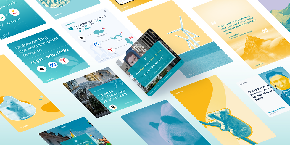
Sample of visual assets I created for our social media channels
Product
The Finuprise trading app has a few core sections a lot of which is driven by data.
Getting your matches
At the start of the signup process, customers fill out a responsible investing profile, stating the business behaviours they do/don’t want to support, as well as some choice modelling questions to help refine. The Finuprise algorithm then provides a list of investments which match these parameters.


"Playlists" of stocks
As well as matches, customers have a lot of other options for choosing companies to invest in based on their values. We provided carefully curated lists which spoke to customer interest or industry, such as Women on Board, Information Technology, Energy etc.
Drawing on familiar patterns from popular apps among younger audiences, such as Spotify, we also introduced the possibility for users to build their own custom lists and share them publicly with the community.
Company details
A very core part of the Finuprise experience, this section was designed to give customers the information they need to make an informed decision on whether or not to invest, balancing both sustainability and financial performance.
Benchmarking against the rest of the industry is an important way of showing the performance of a stock in a given impact area. Key to the design of this section was showing enough information to make a decision without being too overwhelming for non-savvy investors. Consequently, clear visualization of data was a crucial aspect.


Web App
In March 2022, we faced a turning point for Finuprise when we realised that it was time to reassess our priorities as a company and take extraordinary decisions that would redefine the path that the startup had taken up to that moment.
Different circumstances led us to the decision of freezing any further improvements of the mobile app in order to "rebooth" our core product as a web-based platform. The occurrence gave me the responsibility to take on a whole new challenge as I would have had to design a web app for the first time. On the other hand, it turned out to be not only the perfect opportunity to sharpen my UI, layout and responsive design skills, but also to improve the visual language of Finuprise with the development of a brand new design system.


The journey
Understand
Learn
In terms of product and industry, there was much to learn. Between understanding their vision and the market, I also had to learn a lot about share trading and the responsibilities of a trading platform. There are...many.
Analyse
I did a deep dive on the competition, but across 2 different fields.
Looking at other trading platforms such as Robinhood, eToro, Mixpanel and others, I could quickly see what parts of the trading process had been “solved” with solid design patterns, and which bits still had room for improvement, or that were ripe for us to put our own spin on. Additionally, I looked at other unrelated challenger financial products which had a less corporate, younger appeal.
From a brand point of view, I looked into other brands in different industries which are taking an ethical, social or environmental stance as a pillar of their brand. The most powerful took a challenger attitude, calling on their supporters to change the world in small ways. They were visually engaging and their tone was down to earth and sometimes even humorous.

Financial product inspiration
Research
Before I joined the founders had done some extensive research to establish a target market and personas. To build on this I conducted my own 1:1 research to validate and add some human centered design insights. Specifically I wanted to get a sense of our target users level of understanding in the investment space, and to get a sense of how tech savvy they were. Alongside this, I’d also be able to further validate the core concept.
My research showed that people that deeply resonated with the idea tended to not be very savvy to the investment market, though were comfortable with technology. While they were more than happy to try new apps and experiment, the investing process itself was daunting. While they didn’t have a lot of trust in institutions of financial advisors they were willing to trust us, as newcomers, based on our desire to “do good”. However their feedback on our proposed subscription model was mixed. We chose to address this with a variety of options regarding monetisation.

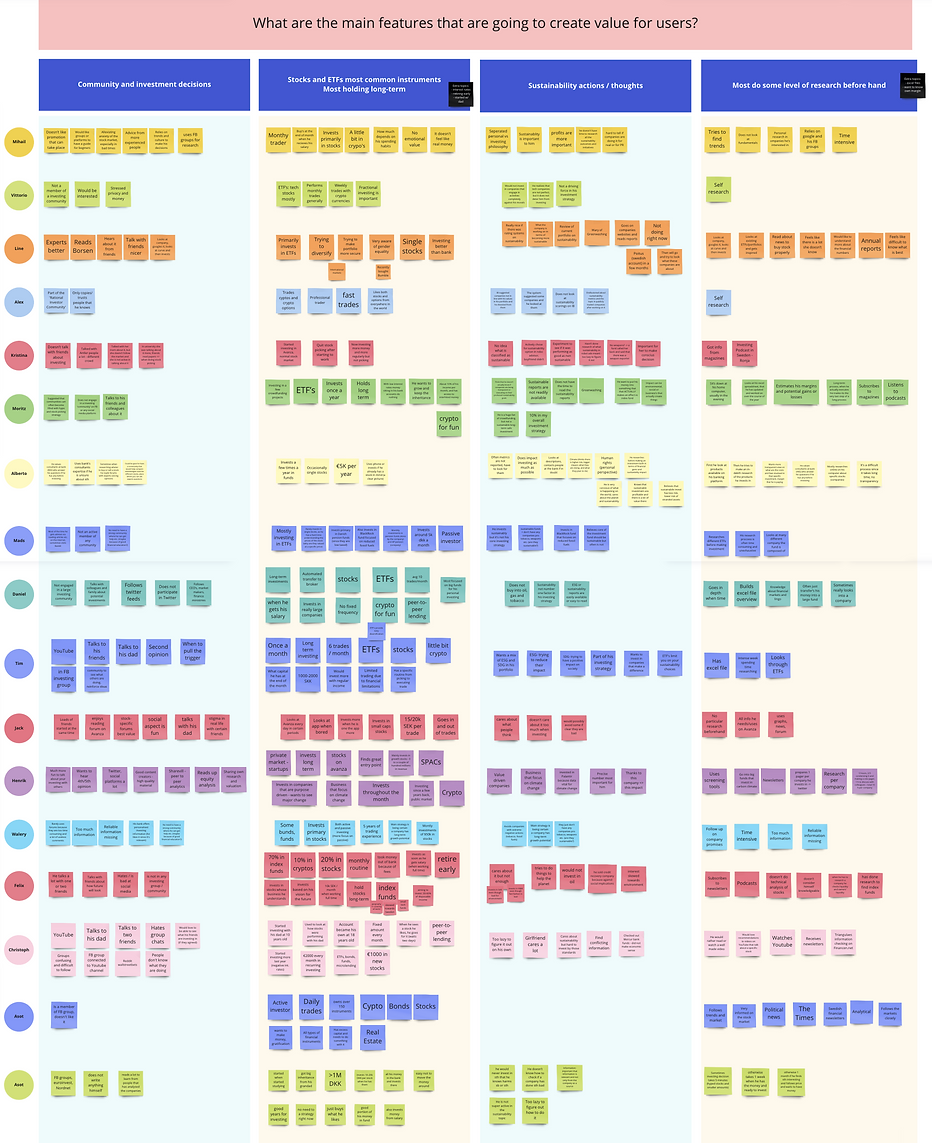
Synthesis of user research / interviews
Define
Creating a brand
The founders and I had a whiteboard session to properly define who were were and where we wanted to go. The initial branding (logo, colour palette, fonts) that had been done was a good starting point, but was too corporate for the direction we wanted to go, so needed some refining along the way. I started a (very) lean brand guidelines process, which would act as a north star for the product to come.
Shared vision
To identify which functionality was core to the experience and which could wait till after launch, we conducted multiple whiteboard sessions as a team, sketching out the core journeys of the app. This allowed us to make a plan for adding meat to the bones of the design in an iterative fashion, and gave the development team a sense of the platform work that they could start on immediately, while I fleshed out the detail in comprehensive user flows for the core sections. This led to wireframes and prototypes which would be taken into testing.

Information architecture for mobile app

Early user flow (Registration / Sign In / Onboarding)

Excerpt from early user flow (Registration / Sign In / Onboarding)

Make
Interviews and feedback
I built a test then iterate loop after every sprint. The testing would consist of either face to face or remote sessions with participants who matched our personas, and include completing some tasks to test the usability and viability of the work done in that sprint.

Mapping the usability testing results using Notion
UI
One of the core tradeoffs we made for the app’s launch was to create an extremely simple UI style. To get things moving, the development team started building based on the wireframes, and so final styling of the app was essentially limited to type and colour choices to modify the base wireframes. Fortunately this bare aesthetic actually worked pretty well for both our brand and for functional clarity, though the opportunity to improve the UI with a design system across the whole app was taken in the iterations after launch.
Design system
Components library
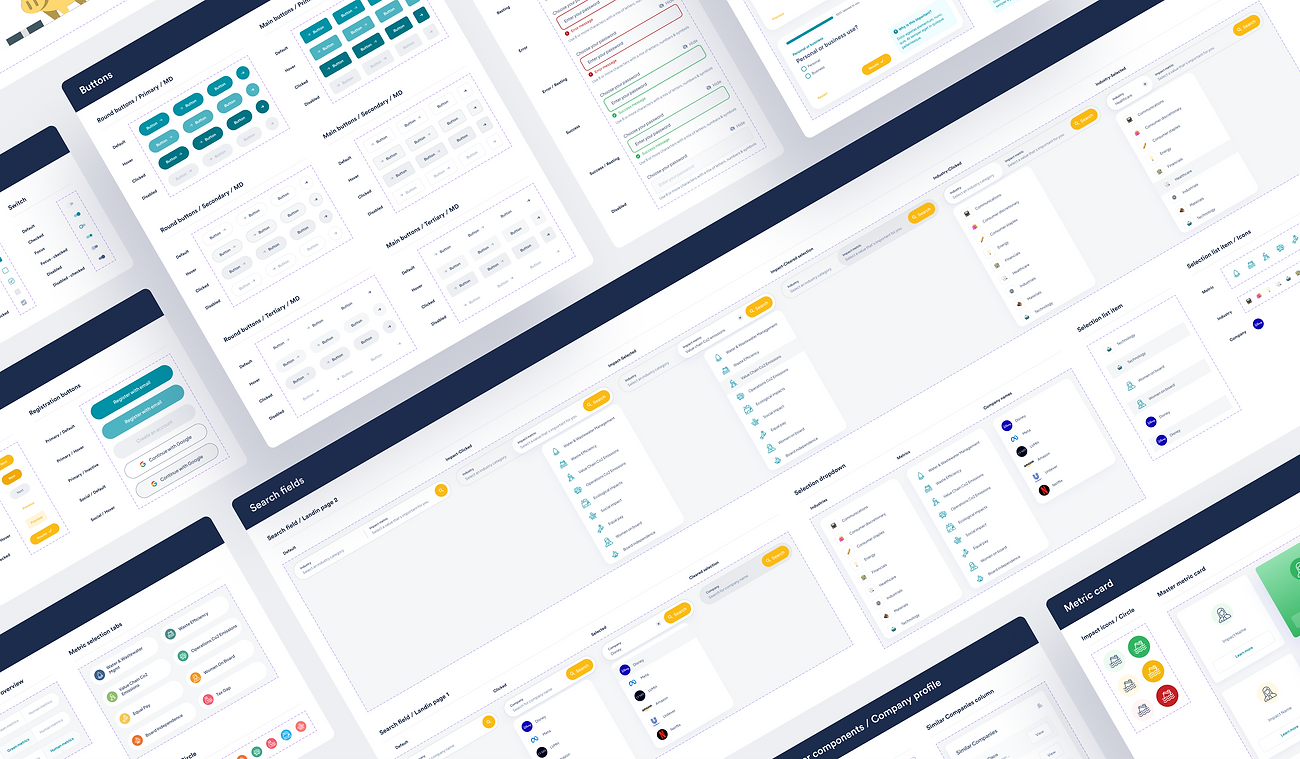
The original UI was very wireframe-y due to time constraints, so in conjunction with other updates, I worked on the creation of a proper design system and UI, bringing consistency and cohesion to the product.
When designing UI components, reusability and responsiveness is something that I always keep in mind. The components have to be carefully designed, developed and maintained so that they cover all possible scenarios such as long texts, positions, and different screen sizes.

Excerpt from Figma library file for design system


Iterating
We learnt a lot since the initial launch, and made changes big and small as we continued to iterate on the product. Here are some of the larger iterations that were made:
Playlists
With real users downloading the app, we were able to get some feedback around what was working and what wasn’t. We simplified and created some hierarchy within this section, as well as making the criteria by which the stocks are ordered easier to understand, with the use of a sortingg system ranking the stocks based on their sustainability metrics score.
We also made clearer how users can start following the playlist in order to receive updates in the form of notifications, as well as adding stocks to their Watchlist or the playlists they created.

Original design of the playlist section

Playlist design after iterations

Playlist user flow with updated UI
Company profile
Through speaking to customers, we found that this section needed simplifying. We took out anything superfluous and added a graph which summarizes the sustainability performance of the company by showing the percentage of good, average or negative scores across all metrics. Customers also had some issues scrolling through the different impact metrics, so we modified the UI of that part to make those info easier to access.

Original design of the company profile

Company profile after iterations

Company profile user flow with updated UI
User profile
Several issues came to light when we tested how users behaved when searching for options that they would find in the user profile. Lots of suggestions were taken in consideration to redesign the navigation in order to make it easier to access the profile settings, the Watchlist, the saved playlists and the created playlists.
We also made sure to remove any ambiguity concerning different interpretations that users ascribed to the purpose of the Watchlist in contrast to the playlists, as well as semantic confusion between saving stocks to Watchlist, adding stocks to a playlists, and following a playlist.

Original design of the user profile

User profile after iterations
Search flow
A new search flow was implemented allowing customers to quickly find any stocks, playlists or users the're looking for, directly from the home screen. The search results are automatically sorted for each category, and you can quickly browse the items by using the tabs positioned on top. This is also a pattern quite familiar to social media users, as it was designed by taking Facebook as inspiration.

Search screens after iterations

Search flow with updated UI